Vox-style videos
Vox-style motion graphics: 10 moves behind the editorial explainer look
Vox-style motion graphics, move by move: highlighted labels, maps, annotation, paper transitions, parallax and stepped motion, with timings and a label spec.
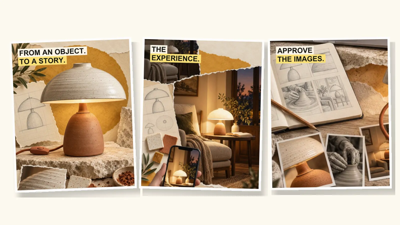
Vox-style motion graphics are editorial motion design: every moving element exists to explain the narration, not to decorate it. The vocabulary is small and recognisable. Short highlighted labels, maps that trace and zoom, documents with a line marked in highlighter, circles and arrows drawn over photographs, and paper collage that slides, peels and drifts in slightly stepped motion.
This guide breaks the look into ten moves, with what each one is for, how it is built and how long it usually lasts. It closes with the label spec we use, where AI helps and where it shouldn't, and what to ask for when you hire a motion designer. For the history and the names of the style, see what Vox-style animation is called.
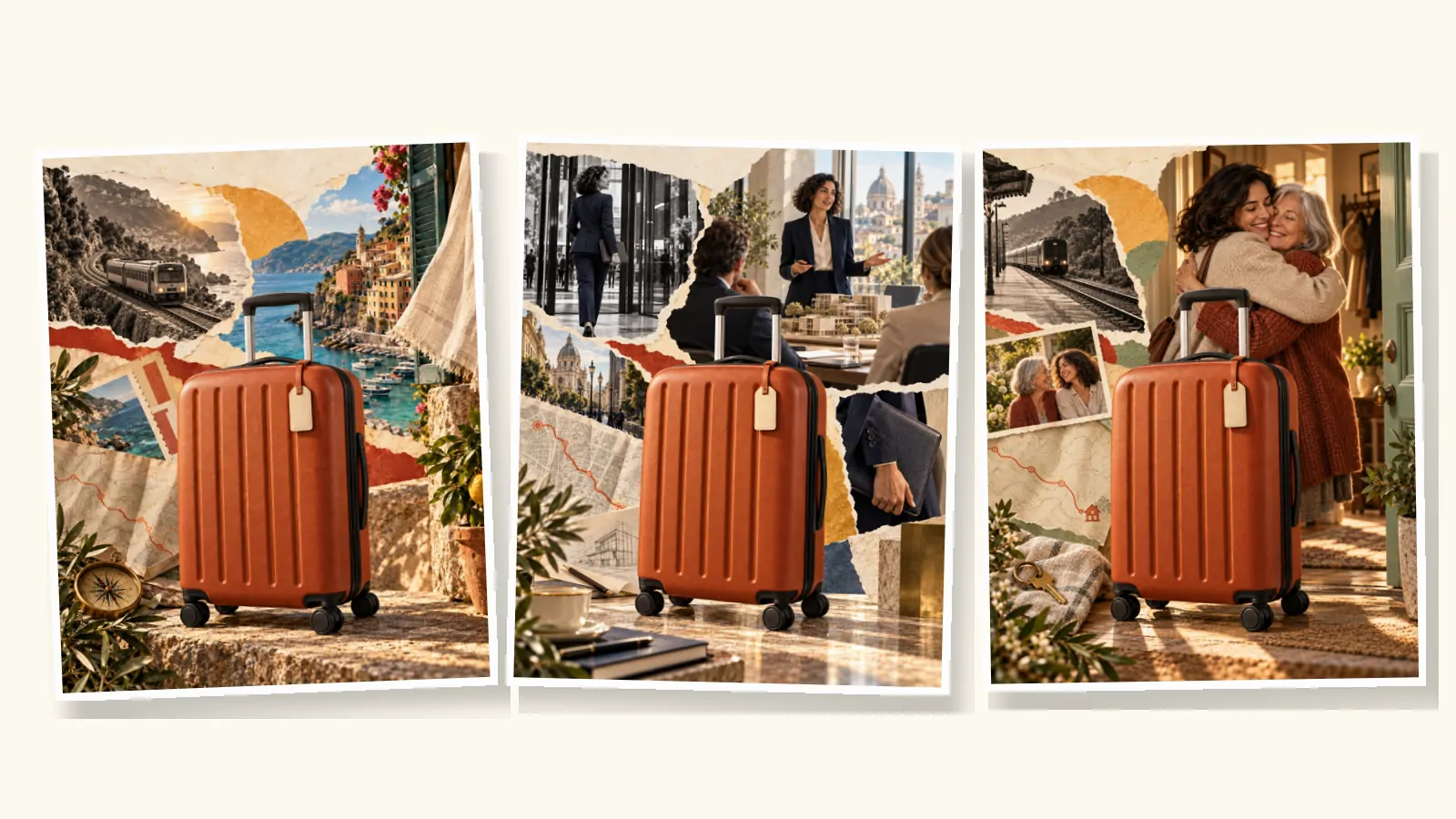
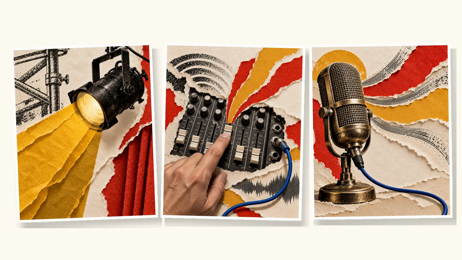
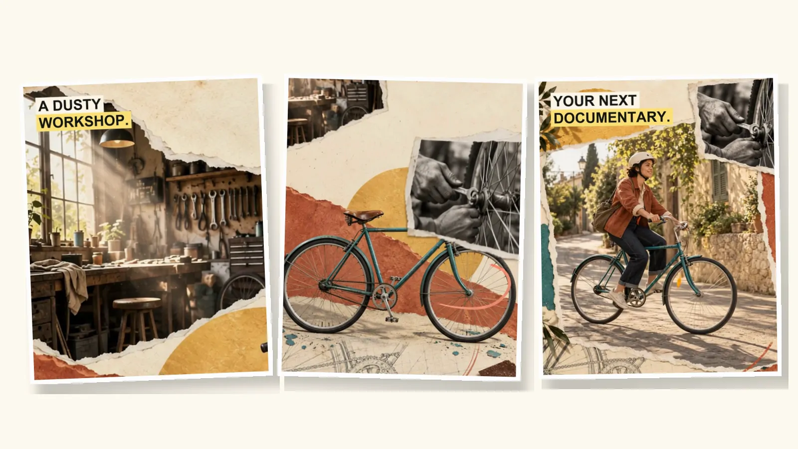
Here is one of our ads. Watch it once for the story, then again for the graphics: the labels, the punch-ins, the transitions between scenes.
The ten moves
1. The highlighted label
Two to six words in heavy uppercase type, on a solid block of colour, like a marker stroke across a printed page. It names the one thing worth remembering from the line being spoken. In a muted feed, the labels alone should tell the story. The label either appears on the cut, as in our ads, or arrives with a quick swipe of the highlight from left to right.
2. The document zoom
A newspaper clipping, a letter, a report or a web page sits on the desk. The camera pushes in and a highlighter marks the sentence that matters. This is how an explainer shows its evidence on screen instead of asking the viewer to trust the narrator. Use real documents you have the right to show, and keep the highlighted passage short enough to read.
3. The map
A map traces a border, zooms to a city or draws a route from A to B. Maps are the signature of series like Vox Atlas. Its producer, Sam Ellis, has described a five-week video that was mostly him tracing maps from old books (Storybench). Accuracy matters more than polish here; see the maps section below. Maps and documents carry most of the weight in a Vox-style documentary.
4. Annotation
Circles, arrows, underlines and brackets draw themselves over a photograph to point at a face, a detail or a number. In After Effects this is usually a shape layer with a Trim Paths animation. Keep the stroke hand-drawn and slightly imperfect, in one accent colour per video.
5. The chart that builds
Bars grow, a line draws, a number counts up. In the editorial version, the chart often grows out of a real object: Vox's art director describes a paper clock that turns into a pie chart (Storybench). Build charts from the actual data, typeset every number, and cite the source on screen.
6. The parallax push-in
Layers of paper sit at different depths, and a slow camera move makes them slide past one another. It is the default motion of the style: it keeps a still collage alive without competing with the narration. Keep it slow, about five to ten percent closer over the whole shot.
7. Paper transitions
A sheet tears away, slides off or peels back to reveal the next scene underneath. These transitions belong to the material: paper does what paper can do. A morph, where one shape melts into another, breaks the illusion.
8. The match transition
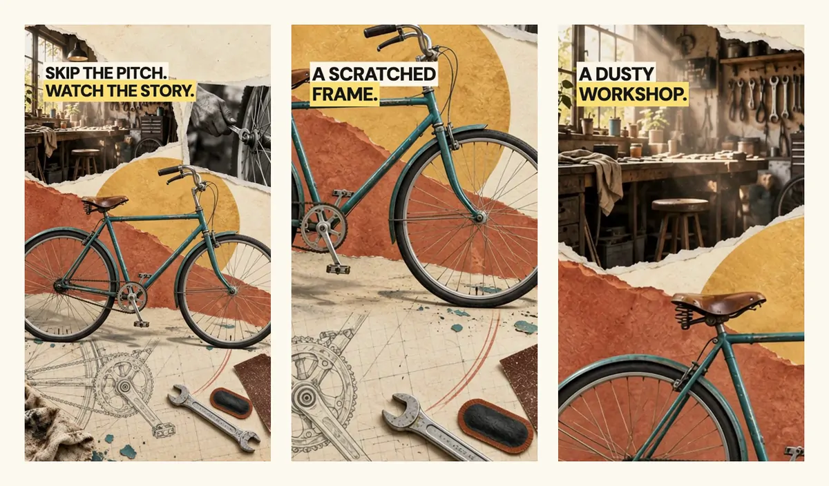
The eye follows a shape from one scene into the next. In our bicycle ad, the move from the repair to the first ride is carried by the round shapes of the wheels and a coral paper ribbon that sweeps across the frame. Find the shape the two scenes share: a circle, a line, a colour, a direction of movement.
9. The punch-in
Cut into a detail of the same collage to show exactly what the narrator names. A detailed scene image can provide three or four shots. In our bicycle ad, one opening image gives the wide shot, the scratched frame and the dusty workshop.
10. Texture and stepped motion
The last layer is the one you notice least. A paper or grain texture sits over everything, sometimes cycling through five or six textures two or three times a second. Graphics animate at 12 frames per second inside a 24 fps edit, so motion moves in small steps instead of gliding. PremiumBeat's breakdown of the look describes both techniques (PremiumBeat).
Timings at a glance
Starting points at 24 frames per second. The narration always wins.
| Move | Typical length | Notes |
|---|---|---|
| Label | On screen for 1.5 s or longer | Hold it until the line ends |
| Highlight swipe | 6–8 frames | Then hold still |
| Document zoom | 2–4 s | Highlight the line as it is spoken |
| Map zoom or route | 2–5 s | One movement per shot |
| Annotation draw-on | 8–15 frames | One accent colour |
| Chart build | 1–2 s | Pause on the final value |
| Parallax push-in | Whole shot | 5–10% closer, eased |
| Paper transition | 12–24 frames | Land it on a pause in the voice |
| Stepped motion | 12 fps in 24 fps | Each position holds two frames |
The Vox-style animation tutorial shows how to build several of these in After Effects, CapCut or with AI.
Our label spec
The labels in our ads follow the same few rules. We render the type separately from the artwork, so it is always sharp and correctly spelled.
| Property | Our setting |
|---|---|
| Words | Two to six, in one or two lines |
| Type | Heavy sans-serif, uppercase, tight letter spacing |
| Colours | Near-black text on a pale yellow highlight; some ads set the first line on cream |
| Position | Near the top, in a quiet area left clear in every scene image |
| Size | 48–58 px on a 720 px wide frame, about 7–8% of its width |
| Timing | Appears on the cut and holds for the whole shot |
Near-black on pale yellow gives a contrast ratio of roughly 13:1, far above the 4.5:1 that the web accessibility guidelines ask for text (WCAG 1.4.3).
A visual system, not a set of scenes
What makes motion graphics feel like one film is repetition: the same palette, the same materials and the same type rules in every scene. For our music venue ad, the direction was written down before any image was made: warm cotton paper, torn edges, photographic cutouts, charcoal engravings, vermilion, mustard and restrained cobalt.
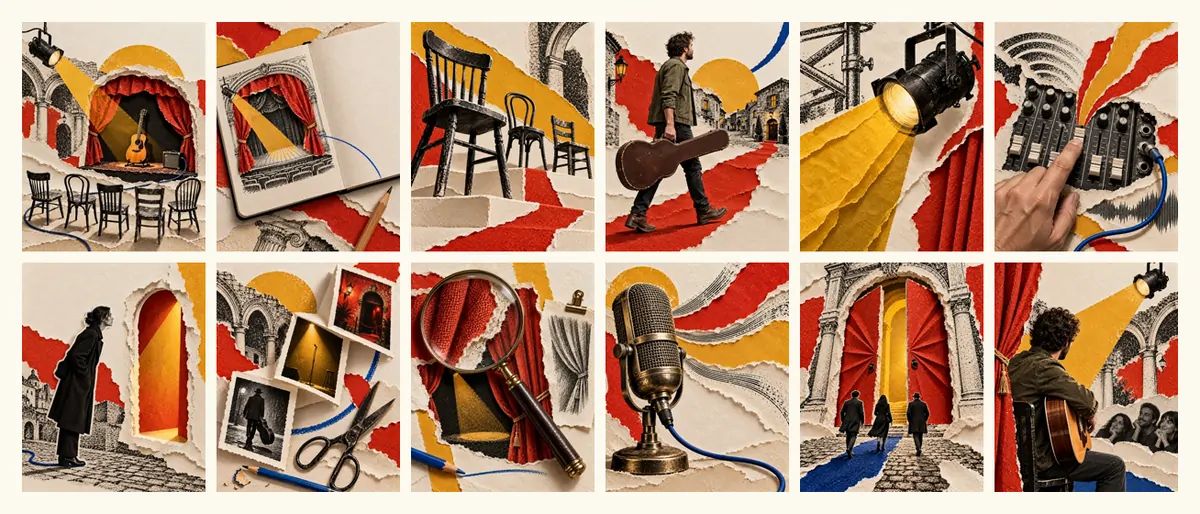
Write your system down in five lines: paper, palette, cutout style, type, accent colour for annotation. Give it to every designer and every prompt.
Maps without mistakes
- Start from real data. Natural Earth publishes public domain map data for countries, coastlines and cities. Old printed maps in public collections are another source, as long as their rights are clear.
- Use map tools for maps. In After Effects, the GEOlayers plugin draws maps from online data sources as editable layers (aescripts).
- Never let an image model draw a map. It invents borders, coastlines and place names. Generate the paper, the texture and the surrounding collage; build the map itself from data.
- Label places as type, not as part of the artwork, and check every name.
The same rule applies to charts and numbers. In our scene images we ask for "no text of any kind… digits", and add every word and figure afterwards.
Accessibility
- Contrast. Keep label text at 4.5:1 or more against its background.
- Flashes. Don't flash anything more than three times a second (WCAG 2.3.1). Rapid texture cycling and strobing transitions can cross that line.
- Captions. Publish a caption file with the full narration (WCAG 1.2.2). Labels summarise; they don't replace captions.
- Reading time. If a label can't be read twice at full speed, it is on screen too briefly.
Where AI fits, and where it doesn't
| Element | AI is good for | Make it yourself |
|---|---|---|
| Collage scenes | Paper, cutouts, textures, lighting | Final approval of every image |
| Motion inside a scene | Hands, dust, light, slow camera moves | Mechanical detail you need to be exact |
| Transitions | Paper slides between two approved images | The choice of what links them |
| Labels and numbers | Drafting the wording | Typesetting every word and figure |
| Maps and charts | The surrounding collage | The map or chart itself, from data |
Our AI workflow guide has the prompts we use for scenes, motion, voice and music.
Hiring a motion designer
Vox-style motion graphics are a common freelance request, often bundled with maps and documentary visuals. To get what you expect, ask for:
- Style frames first: two or three finished stills before any animation.
- An animatic: the stills cut to the narration, with rough moves.
- A label sheet: every on-screen word in a list you can proofread.
- Sources for every map, chart and document shown on screen.
- Each format you need, with type re-set for that frame, not a crop of the 16:9 master.
- The project files, if you want to make changes yourself later.
For prices, our cost guide compares freelancers, studios, DIY and AI.
FAQ
What are Vox-style motion graphics?
Editorial motion design built from paper collage, highlighted labels, maps, annotation and charts, moved with restrained, slightly stepped motion. Every element explains the narration rather than decorating it.
What software is used for Vox-style motion graphics?
After Effects is the standard tool, and Vox's own teams describe using it. GEOlayers adds map data inside After Effects. CapCut can approximate the look for short videos, and AI video tools can generate the collage scenes and their motion.
How do I make the motion look handmade?
Animate graphics at 12 frames per second inside a 24 fps edit, add a paper texture, keep shadows soft and edges torn, and avoid perfectly smooth vector shapes.
Can AI make Vox-style motion graphics?
AI can generate the collage scenes, contained motion and paper transitions. Labels, numbers, maps and charts should still be typeset or built from data, because image models misspell words and invent figures.
How long should a label stay on screen?
At least a second and a half, and usually until the narrator finishes the line. Two to six words is the right amount for that time.
The ads and scenes in this article are illustrative work we produced by hand while building vox.style; the products, people and brands are fictional. vox.style is an independent product, not affiliated with Vox or its owners.